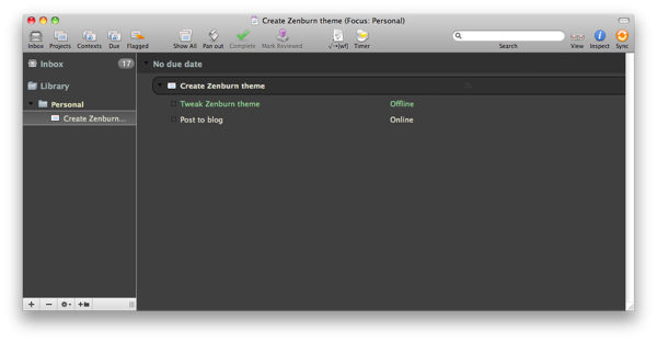
Here’s a draft Zenburn-based theme for OmniFocus. Due to some limitations of the theming engine, some of the status indicators (repeating, flagged, etc.) are displayed as grey-on-grey and are therefore somewhat difficult to read. Otherwise it’s quite usable. Download it here.

Great theme! Thanks so much.
I love this for the same reasons that I love TweetDeck; Nice and easy on the eyes. Thank you!
@hammyhavoc
Dan:
Thanks for the scripts and theme for OmniFocus.
Is there any way to change the color of hyperlinks? The blue-on-grey is a little hard to read. And I presume that there is no changing the check box color.
Thanks, David
David—sorry for my delayed reply… unfortunately there’s no way to change hyperlink color at the moment; I’ve emailed the OmniGroup with a feature request for this, and I’d encourage you to do the same.
Great theme…thanks! I’m trying it now.
Love the way it looks! Giving it a go right now
Very beautiful. Light and pleasant! Congrats.
Hi Dan, do you know if omnifocus group has changed the hyperlink colour option? Havent seen any updates on this, thanks and awesome theme by the way. I love it!
Great theme, thanks. Would you consider uploading it to http://ofthemes.com/ ? I have no connections to this site but thought it would be handy for other users.
Love the theme. Easy on the eyes but elegant, too. The grey-on-grey is hard to read, but I mostly use those as buttons (and not something to read). Still, thanks for noting that.